
“Bare ruin’d choirs, where late the sweet birds sang…”—Shakespeare, Sonnet LXXIII. (Source).
For the kingdom of heaven is as a man travelling into a far country, who called his own servants, and delivered unto them his goods. And unto one he gave five talents, to another two, and to another one; to every man according to his several ability; and straightway took his journey. Then he that had received the five talents went and traded with the same, and made them other five talents. And likewise he that had received two, he also gained other two. But he that had received one went and digged in the earth, and hid his lord’s money. After a long time the lord of those servants cometh, and reckoneth with them. And so he that had received five talents came and brought other five talents, saying, Lord, thou deliveredst unto me five talents: behold, I have gained beside them five talents more. His lord said unto him, Well done, thou good and faithful servant: thou hast been faithful over a few things, I will make thee ruler over many things: enter thou into the joy of thy lord. He also that had received two talents came and said, Lord, thou deliveredst unto me two talents: behold, I have gained two other talents beside them. His lord said unto him, Well done, good and faithful servant; thou hast been faithful over a few things, I will make thee ruler over many things: enter thou into the joy of thy lord. Then he which had received the one talent came and said, Lord, I knew thee that thou art an hard man, reaping where thou hast not sown, and gathering where thou hast not strawed: And I was afraid, and went and hid thy talent in the earth: lo, there thou hast that is thine. His lord answered and said unto him, Thou wicked and slothful servant, thou knewest that I reap where I sowed not, and gather where I have not strawed: Thou oughtest therefore to have put my money to the exchangers, and then at my coming I should have received mine own with usury. Take therefore the talent from him, and give it unto him which hath ten talents. For unto every one that hath shall be given, and he shall have abundance: but from him that hath not shall be taken away even that which he hath. And cast ye the unprofitable servant into outer darkness: there shall be weeping and gnashing of teeth.
(Matt. 25: 14-30 KJV).
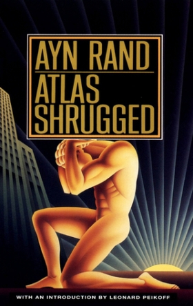
“There are two sides to every issue: one side is right and the other is wrong, but the middle is always evil.” (Ayn Rand, Atlas Shrugged 1054).
In every age, the relationship of the Church and the world is a fraught issue. The particular vicissitudes of politics, society, and spirituality always bring up new challenges for the Body of Christ in hac lacrimarum valle. Rod Dreher’s new book, The Benedict Option, recently released by Sentinel, is a contribution to the question as we must face it in our own time. Dreher says in the book that he hopes to “sound the alarm for conservative Christians in the West,” so that they can survive “the greatest danger” of our age, “the liberal secular order itself” (The Benedict Option 236). He envisions Christians forming counter-cultural communities to sustain the life of the Faith through “modern repaganization” (197).
Insofar as Dreher wanted to start a conversation, the book is a smashing success. It has been praised and pilloried in the Christian blogosphere and beyond. Over the course of the last three and a half years, Dreher has even inspired rival “options” such as Chad Pecknold’s Dominican Option, Michael Martin’s Sophia Option, John Mark Reynolds’s Constantine Project, Dr. Carrie Gress’s Marian Option, and more. I may get into some of those reactions over the course of this essay. What I will not do is make much reference to Dreher’s authorial meddling, including his obsessive and often highly vindictive reactions to reviews he dislikes. It is enough to acknowledge that Dreher is partaking of the conversation he wanted to start. Considered solely as a social phenomenon, the Benedict Option has succeeded at beginning those important conversations about the Church’s place in the (post)modern west.
But books cannot be reduced to the conversations they inspire. They are texts, and eventually we need to evaluate them as texts. Under that demand, the record is much murkier. There are many good things about The Benedict Option, but also many bad things. Throughout, the book’s noble aspirations are frustrated by poor style, errors of content, and a palpable, hand-wringing fear.
In the interest of charity, however, I’ll begin with a few of the positives.
Dreher is concerned with the right problems: individualism, hedonism, consumerism, liberalism, secularism, relativism, etc. In short, the toxic cocktail of capitalist modernity. Of course, Dreher hardly bothers to point out that these issues are intimately bound up with the economic system as such. But I digress.
Dreher follows upon greater scholars like, inter alia, Alasdair MacIntyre and Charles Taylor. There has been some controversy over Dreher’s reading of MacIntyre, but ultimately, I’m not sure it matters. Dreher was inspired by a line in After Virtue and came up with his own project (sorta…Gabriel Sanchez, among others, rightly points out that Dreher’s vision isn’t all that original anyway). So be it. The fact remains that, insofar as the book is a polemic, Dreher is aiming at the right kinds of cultural forces. It also helps that Dreher specifically limits his scope to the West. Any attempt to integrate the cultural experience of Christians in, say, Sub-Saharan Africa or the Far East would no doubt lead to an extremely different set of conclusions than those which Dreher has offered. His command of social science and ethnographic work (if not historiography) about our own situation is impressive.
Moreover, Dreher is right to mine the wisdom of the monastic tradition. Monasticism, where rightly practiced, stands as a sign of contradiction to the world’s banality, vices, and distractions. He attempts to draw something like a social doctrine out of the Rule of St. Benedict, a project I’ve long thought might be worthwhile if attempted with more systematic rigor. Dreher writes, “Because it dictates how Benedictine virtues are to be lived by monastic communities, the Rule is political” even while he recognizes that “The telos…of a monastic life is not the same as the telos of life in a secular state” (The Benedict Option 88). His Third Chapter, describing the life and spirituality of the Monks of Norcia, is a loving testament to this inspiring young order. Dreher also advocates for Christian families to turn their homes into “domestic monaster[ies]” and attempt a genuine ascetic life (124-26). In fact, his overriding goal—to bring up the next generation as faithful Christians, and thereby preserve Christianity as such—is an indisputably admirable one.
I might add that some of his thoughts on education are sensible. While I’m more skeptical than Dreher is when it comes to Classical Education, and the canon of Great Books in particular, I think the model works best at the pre-collegiate levels he imagines. I also don’t think he’s right to totally write off secular academe, but I know from the experience of friends that the academy can be a sometimes unjustly punishing place for practicing Christians. My own view is that this places an even greater urgency on Christians to contribute to intellectual life in America inside the universities, wherever and whenever possible. Rowan Williams is right to point out that
The Benedict Option…confronts the prevailing consensus about how far the majority is willing to make room for principled dissent and public argument – yet at the same time shows a rather dispiriting lack of confidence in public argument.
I can understand why Dreher and his allies don’t have high hopes for America’s educational system, but I also think surrendering our place in the universities would be a disastrously bad idea. I’ll get into that in my follow-up to this review, when I hope to put forward some of my own suggestions.
Dreher also includes a really great, extended shout-out to the Center for Christian Study in Charlottesville. Having spent the better part of my Sunday afternoons at “the Stud” for meetings of the G.K. Chesterton Society, I can vouch for its excellence. I have friends who have lived there, and it’s done wonders for their personal faith lives. In fact, I first saw Dreher speak at the Stud, when he visited in February (or was it January?) of 2016. He wasn’t half bad, either. The room was packed, and he gave a pretty good pitch for what he was, even then, calling “the Benedict Option.”
But I also remember a niggling doubt about the whole thing, which I couldn’t quite identify, much less express, at that early stage. Now, having read the book, I feel more confident in my objections—but once again, I digress. I wanted to start off with the praiseworthy parts of the book.
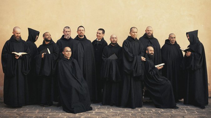
The Benedictine monks of Norcia, one of the greatest religious families in the Church today. I had occasion to hear their spiritual father and founder, Dom Cassian Folsom, say Mass at my fist parish, St. Brigid’s in Johns Creek, Georgia. I believe I was even blessed by him at Communion, since he came before I was received. A genuine saint. (Source).
Dreher’s “anti-politics” are timely and wise. He makes good use of the examples left to us by Czech dissidents during the Communist years. While I have a few qualms about some of his proposals—such as his insistence that Christians focus all of their energy on Religious Liberty activism and legislation—I share his disillusionment with the organized forces of both right and left.
I also commend him on his total disdain for Donald Trump. Dreher writes,

Trumpolatry. Unless you read it, as I do, as Jesus telling Trump to resign. (Source).
Though Donald Trump won the presidency in part with the strong support of Catholics and Evangelicals, the idea that someone as robustly vulgar, fiercely combative, and morally compromised as Trump will be an avatar for the restoration of Christian morality and social unity is beyond delusional. He is not a solution to the problem of America’s cultural decline, but a symptom of it. (The Benedict Option 79).
Amen. As someone who did not vote for Donald Trump and hopes never to do so, I acclaim Dreher for putting those words in print. Too many Conservatives who once thought much more clearly about the morals of their leaders have since bowed and done homage to the Golden-Coiffed Calf.
There were other positive moments. The whole idea of reinforcing Christian community in the face of cultural and political opposition is a worthy goal—and a surprisingly risky one at that. Any communitarian project is necessarily fraught with certain dangers, particularly in a world already defined by stark social divisions across race, class, and other categories. As I read, I was repeatedly and pleasantly surprised by objections Dreher headed off at the proverbial pass. He hopes that Benedict Option communities can come together across ethnic and racial divides, and he recognizes the dangerous tendencies of tight-knit communities to become closed, coercive, and cultish (81, 138-143). He also gives a few really great examples from the Mormon experience (132, 34-35). While Dreher doesn’t provide any practical advice for, say, Benedict Option parents whose children come out to them as gay or lesbian, one gets the sense that he’s not in favor of shunning, shaming, and disinheritence. Which is sensible.
(And yes, I realize that as an Amish Catholic, I ought to be in favor of shunning generally. Like Whitman, “I contain multitudes”).
I think his chapter on sexual ethics is probably one of the more sensible passages of the book. The very day that I finished the chapter, I came across this article on the possibility of a new liturgy to mark gender transitions (possibly even rebaptism) in the C of E. When Dreher says that sexual teaching is a lot closer to the heart of the faith than liberals might claim, he’s not wrong.
Finally, I’ll say that he’s right to pin his hopes on beauty. Building on Joseph Ratzinger and Matthew Crawford, Dreher writes,
That’s enough, David A.R. White. (Source)
…the most effective way to evangelize is by helping people experience beauty and goodness. From that starting point, we help them to grasp the truth that all goodness and beauty emerge from the eternal God, who loves us and wants to be in relationship with us. For Christians, this might mean witnessing to others through music, theater, or some other form of art [if only they could produce something that isn’t deeply, obnoxiously cringey, but that’s not a problem worth getting into here]. Mostly, though, it will mean showing love to others through building and sustaining genuine friendships and through the example of service to the poor, the weak, and the hungry. (The Benedict Option 119).
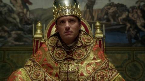
Christian art done well: The Young Pope. (Source).
There are hardly any words in the book which earn my stronger approbation. Dreher is simply correct when he argues that we should “[do] activities that are pleasurable, not merely dutiful” (142). Indeed.

“Moonlit Lake with a Ruined Gothic Church, a Church and a Boatmen.” Sebastian Pether. (Source).
In spite of all these positives, I remain a BenOp skeptic. The book is rather flimsy, riddled with numerous problems. Dreher’s style never manages to break free of the chatty and occasionally shrill blogger’s voice that marks his online fare. Yet it lacks much of the humor that characterizes so much of what he writes at The American Conservative. I could overlook that sin, however, if his content were not similarly flawed. Dreher is dangerously allergic to the one thing that can save his text from its inner contradictions: nuance.
That failure colors every chapter in the book to a greater or lesser degree.
Religion is a famously thorny and multilayered subject. A religious writer aiming at the popular market can be forgiven for simplifying complex ideas to reach a broad audience. But Dreher’s approach veers away from educational simplicity and into outright reductionism.
For the sake of brevity, however, I will only get into the three very specific problems that I found most troubling to Dreher’s project and the quality of his text.
Bad Historiography
First, a somewhat pedantic point.
Dreher’s lack of nuance is most egregious in his historical narrative, given fully in chapter two and sporadically throughout other parts of the book. He argues that the Middle Ages were a time of order and devotion, in which European Christians believed in objective truths under the happy aegis of Scholastic Realism. Everyone had their place, and everyone knew the essential truths of salvation under God’s cosmic rule. Into this pastoral capriccio storms the wicked Nominalists, led by William of Ockham (1285-1347). By suggesting that universals were not real, but merely notional, the Nominalists inadvertently led to the centuries-long collapse of the sacramental worldview and all of Christendom with it.

William of Ockham, the great bogeyman of Dreher’s historical narrative. (Source).
Then came the Reformation, which is bad because it “destroyed…unity and stripped those under its sway of many symbols, rituals, and concepts that had structured the inner lives of Christians” (32). Admittedly, Dreher never mentions anything about the deficient theologies of the Reformers, nor the historical fact that Christendom had been divided since 1054 and, even before that, the Council of Chalcedon—but more on that point later.
Dreher then leads us along a whirlwind tour of Western intellectual history, leaping from one period to another with unsupported assumptions of causality. He cursorily mentions political developments such as the Wars of Religion, the American and French Revolutions, and the World Wars. Interestingly enough, he never discusses Imperialism, Colonialism, Anglo-American efforts to end slavery, or the Holocaust—yet surely all of these phenomena had a significant impact on the construction of Western religion and subjectivity.
Eventually, the reader lands in the desiccated and desecrated landscape of sociologist Zygmunt Bauman’s “liquid modernity,” our own godless world, still reeling from the Sexual Revolution.
Put another way, it’s Richard Weaver warmed over, history stripped of everything but ideas and spilled blood. There are a few problems with this approach.
First, it totally fails to account for the complexity of actual history. Even an intellectual historian doesn’t just deal with ideas as such. Ideas don’t float in the ether; they don’t make their way from one thinker to another by force of osmosis. They are transmitted via books, and through those books, to different communities of readers. Intellectual history is ultimately incomplete without its companion sciences: reception history, textual history, history of the book, economic history, political history, art history, and a tremendous dollop of cultural history. Not all of these need to be present in a given text—and certainly not in a book aimed at the popular market!
But we oughtn’t let Dreher off the hook so easily.
Dreher knows that “Ideas don’t occur in a vacuum,” but his slovenly method leads to dubious lineages of causality (28). Without providing a shred of evidence, Dreher boldly asserts that “Most leaders of the Scientific Revolution were professing Christians, but the revolution’s grounding lay undeniably in nominalism” (33). What were they reading? Was the consensus among scholastic metaphysicians noticeably more nominalist in the 17th century than in prior years? Does that consensus cover all of Europe, or just certain important cultural centers? And if so, why should we believe that said consensus applied to the work of natural philosophers?
Or take another example: “[The term ‘Renaissance’] contains within it the secular progressive belief that the religiously focused medieval period was a time of intellectual and artistic sterility—a ludicrous judgment but an influential one” (emphasis mine, 30). Dreher does nothing to justify this assertion. Almost none of what he has told us up to this point suggests that he’s right. We read nothing about Medieval art or literature. We’ve only learned about the disputes of the Scholastics on a very particular question (no pun intended) and heard how great most people’s worldview was at that time.
Dreher doesn’t take account of the complexities of Medieval life. (Source).
And let’s take a look at that alleged worldview. In a paragraph which (correctly!) begins, “Medieval Europe was no Christian utopia,” Dreher then goes on to write that, “despite the radical brokenness of their world, medievals carried within their imagination a powerful vision of integration. In the medieval consensus, men construed reality in a way that empowered them to harmonize everything conceptually and find meaning amid the chaos” (25). Who exactly are these “medievals?” Just the scholars who sparred in Paris and Oxford, or the nobility, or the knights, or the bishops, or the monastics, or the vast and often perverse majority of illiterate peasants? And which culture? Anglo-Saxons, Franks, Angevins, Normans, Iberians, or the denizens of any of the myriad German or Italian or Celtic fiefdoms? How far West is he spreading his view? Do the Slavs count? And what centuries does he want us to look at? He’s working with an almost thousand year span from St. Benedict to the dastardly Nominalists. If, in fact, the worldview of that Christian civilization was immutable and homogeneous throughout such a wide variety of time and societies, then doesn’t that feed the very criticism that Dreher so stridently rejects, that the Middle Ages were a “time of intellectual and artistic sterility?” (30).
This point matters, insofar as Dreher elevates (read, “romanticizes”) the Medieval Era as his cultural ideal. The Benedict Option is nothing if not a way of thinking about community. So, which community? What are its limits?

The enforcement of Christendom’s social boundaries; the burning of Jews. (Source).
Case in point: what about the Jews? Certainly, they were thought to interrupt that “powerful vision of integration,” which emphatically never included them. Dreher periodically returns to Modern Orthodox Jews as a great example of community-building in the face of modernity (and is right to do so). He goes so far as to call them “our…elder brothers in the faith” (124).
But his praise sits uneasily with his historiography. Only twice does he come close to acknowledging that their survival—indeed, the survival of Judaism as a whole—happened not because of, but in spite of, the Age of Faith. It is not sufficient to recognize that the Jews “have faced horrifying attempts over millennia to destroy their families and communities” (124). We must be clear that, at least in the Medieval era, the chief persecutor was precisely the Christian order that Dreher takes as his model. The one time Dreher does, in fact, mention that it’s Christian persecution, he only does so to discuss how the Jews were forced into the moneylending business. Here then is another historical difficulty that Dreher fails to adequately acknowledge or reconcile with his greater narrative.
Of course, Dreher doesn’t need to answer all of these questions, since he’s not writing an academic history of how modernity—or more properly, modernities—emerged. My point is precisely that, due to the constraints of his form and audience, his historical narrative is naturally going to paper over important, substantive nuances. And those nuances are where the truth is to be found. A project so heavily predicated on a particular way of understanding our historical moment at least ought to get its history right.
As a side-note, I’ll add that Dreher also stakes his claim pretty heavily on readers accepting his comparison of our own age to the advent of the Dark Ages (hence the whole St. Benedict thing). That’s a comparison I’m not willing to make. If anything, our times more closely resemble early modernity—a point I hope to explain more fully in my follow-up to this article. Suffice to say, Sam Rocha is correct to point out that Dreher’s view of the Middle Ages is, at best, incoherent:
On the one hand, he sees the Middle Ages as the period that required a radical retreat in the face of the fall of Rome. On the other hand, he sees the Middle Ages as a period of enchantment and deep faith. These two stories are both vastly oversimplified, but they are quite off when they are both said to be true simultaneously. How can it be the case that when Rome fell the Benedictines endured the Middle Ages guided by their Rule and, also, that the fall of Christianity happened, like Rome, after the end of the Middle Ages? Anyone can see that this story makes no sense logically. Historically, it makes even less sense.
I’m not suggesting that Dreher is necessarily wrong in his various judgments. He may well be correct in accusing the nominalists of a kind of cultural deicide (although it overlooks the Christian nominalist tendency, closely tied to empiricism, that numbers Berkeley, Burke, Hamann, Newman, and Chesterton among its ranks). Greater thinkers than him have made a similar claim. But as written, I have no reason to believe Dreher’s intellectual history. He has made a defensible claim, and subsequently decided not to defend it. He has not shown his readers the courtesy of providing evidence.
Dreher’s citations are woefully inadequate. He makes some use of MacIntyre and Taylor, who are smart, respectable philosophers. But they are not historians. To his credit, he does draw upon C.S. Lewis’s The Discarded Image, David Bentley Hart (although it’s his religious philosophy and not his church historical work) and Brad Gregory, an honest-to-God historian working with an honest-to-God historical method. But he incorporates Gregory to make a point that’s barely substantive, that different ideas about Christianity led to different ways of living out Christianity. Did we really need the authority of an historian to make a point that is already so blindingly obvious? Moreover, all of these citations come in the first two parts of his history: the Middle Ages and the Renaissance/Reformation. But whither Eamon Duffy? Whither Richard Rex? Whither Alexandra Walsham?
If Dreher generally fetishizes the Middle Ages, he commits the opposite sin in his treatment of modernity. He sees only the negative. Dreher’s readers would be forgiven for forgetting that, in fact, the Church has endured and ameliorated the conditions of modern life for 500 years, and that it has given the world innumerable saints during that time. Leaving aside Church history, I’ve already mentioned that Dreher omits the various emancipatory struggles of the 19th and 20th centuries. Why? Perhaps because it troubles his claim that we have arrived at a uniquely bad moment for the Church, a time in which there is essentially nothing to be gained from the culture at large.
Here, too, he lacks nuance or evidence. See his description of Freud:
Sigmund Freud, the founder of psychoanalysis, found his true genius not as a scientist but as a quasi-religious figure who discerned and proclaimed the Self as a deity to replace the Christian religion. (41).
This is a huge interpretive move that Dreher never justifies. At all. He just asserts it as if it’s fact, not a highly contextual evaluation of a complicated historical figure whose legacy has been very mixed. None of the two paragraphs that follow even mention any of Freud’s writings.

Transhumanism gets no mention in The Benedict Option. (Source)
Dreher’s view of modern technology is equally dim. Here, the problem is not that he’s overly negative, but that he’s misplaced that negativity. The book closes with an oddly stunted chapter that launches an hysterical criticism of smartphones, social media, and the Internet as such without ever bothering to mention transhumanism, AI, automation, or any of the other very possible threats looming on the horizon. Nor does he devote any space to environmental concerns. Here, too, Dreher’s failure to provide proper nuance or evidence leads to sentences like this: “The seed that was planted in the fourteenth century with the triumph of nominalism reaches its full ripeness in Technological Man” (223). Or, later, “The most radical, disruptive, and transformative technology ever created is the Internet” (224). Besides providing zero historical evidence to support either of these statements, Dreher couples his paragraphs of hysteria with passages like this:
And guess what? It’s wonderful. It has made my life better in more ways than I can count, including making it possible for me to live where I want to live because I can work from home. The Internet has given me a great deal and does every day. (224).
The effect achieved is stylistic and tonal whiplash, not thoughtful nuance.
I mentioned earlier that this criticism is somewhat pedantic. I own that. But I do think it matters. Dreher stakes his project on an historical claim about our own times. He wants to persuade us of his project’s urgency by telling a story about Christianity in the West. Failing to provide much evidence and ignoring the essential complexity of nuances means that his narrative just doesn’t come off as all that convincing.
Bad Theology
Enough of the historical criticism. The book’s deeper problem lies in its spiritual and theological defects.

The ruins of Whitby Abbey. (Source).
There are a few minor theological problems, such as his lamentable claim that the Rule of St. Benedict is “simply a training manual. Modern readers who turn to it looking for mystical teaching of fathomless spiritual depth will be disappointed” (15). While I would hate to presume, I think that statement would probably shock someone like Dom Mark Daniel Kirby, whose own commentaries on the Rule have brought out a rich mystical dimension in the text (see this example, in which he draws upon even more commentators who have done precisely what Dreher denies is possible for the “modern reader”). Ultimately, an error like this is forgivable. If it was the only one in the book, I’d be happy to overlook it.
Alas, there are more fatal problems.
Dreher takes a deeply ecumenical approach in The Benedict Option. By itself, this isn’t an issue. Insofar as his book can serve as an ethnography of American conservative Christianity, it’s probably a good idea. Practically, ecumenism can be helpful when it works towards the bridging of boundaries for strategic, intellectual, or conciliatory ends. Groups like my own aforementioned G.K. Chesterton Society or Dreher’s Eighth Day Books are doing small-scale, fellowship-based ecumenism well (136-37). Chuck Colson and Father Richard John Neuhaus modeled political ecumenism in Evangelicals and Catholics Together, much to the ire of fundamentalists. Similarly, intellectual fora for cross-traditional encounter can be especially productive. Journals like First Things do an excellent job facilitating that kind of positive ecumenism.
But ecumenism that ignores critical, substantive, or normative differences can be dangerous. The churches are separate for important reasons, and the stories and arguments they use to justify those differences are not to be taken lightly. For Dreher’s ostensible project, these differences ought to be of paramount importance. One cannot cooperate with someone to preserve a shared value when laboring under a false unity. Moreover, each ecclesial community will, of necessity, have a different response to the conditions of (post)modernity. They will have to draw upon their own unique resources and traditions. Their strategies will vary based on what they understand the Church to be. We can all agree that the Church—understood correctly—has its own paramount mission, the salvation and sanctification of souls. But our understandings of how the Church is meant to do that job could not be more different. Losing sight of the singularity and urgency of the Church’s salvific mission and character is the greatest danger of all ecumenical work.
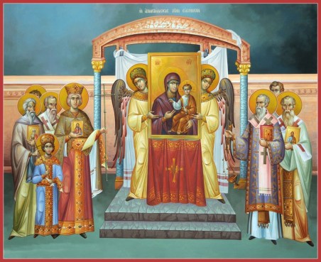
Icon of the Sunday of Orthodoxy, which commemorates the triumph of iconodulic Christianity over the heresy of iconoclasm (Source).
I had hoped to find an ecumenism of encounter in Dreher’s book. Sometimes, I did. When he’s at his journalistic and sociological best, he provides some great anecdotes and insights across all types of American conservative Christianity. Unfortunately, the text is also riddled with a false ecumenism.
Dreher is very fond of speaking of “small-o orthodox,” as if such a thing could ever be anything more than a notional, or, at best, a situational construct. Sam Rocha, once again, puts the point well:
A second confusion is Dreher’s abstraction of Christianity. The book uses Roman Catholic sources and characters, but also includes a smattering of Protestants and a few Orthodox. By the end of the book, Dreher begins to sound like he’s written a manifesto, calling his new order “Benedict Option Christians.” Earlier he calls these “Benedict Option Churches” and “Benedict Option believers.” Just what are these churches? And what are the tenets of this belief? The book itself, with no ecclesiastical authority whatsoever and no scholarly credibility to speak of? This is tremendously abstract because there is obviously a real Benedictine Order that follows the real Rule of St. Benedict, which includes a lay apostolate for people like Dreher.
Rocha doesn’t explore the issue in all of its implications, but he’s on the money.
Dreher signals early on that his ecclesiology is, frankly, heretical. Dreher hopes to speak for and to “faithful orthodox Christians—that is, theological conservatives within the three main branches of historic Christianity” (18, emphasis mine). What revealing diction. Dreher’s working model is essentially branch theory, the heretical idea that Orthodoxy, Catholicism, and Anglicanism are all equally valid expressions of the “One, Holy, Catholic, and Apostolic Church” founded by Christ. In fact, Dreher seems perfectly content to go beyond the Anglo-Catholics who were and are Branch Theory’s most staunch defenders. He is happy to lump in a much wider net of Protestants, including figures like, inter alia, the pastor of “a small fundamentalist church in Minnesota” (112). No Catholic can sign on to this ecclesiology.
If Dreher had merely intended to use the theory as a shorthand for “Christians who are doctrinally and culturally conservative,” then “Dissident Christians” is a much better moniker, one that Dreher should have used throughout the book. It’s brief, it’s political, and it captures the posture towards contemporary culture that animates his entire project. It’s also ecumenical in the right way—something like the “Ecumenism of Blood” described by Pope Francis—and doesn’t lead to the confusion of important theological and ecclesiological distinctions.
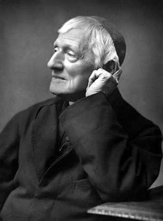
John Henry Newman; Ex-Branch Theorist. (Source).
True, Dreher says “Christianity,” not “Church,” but there’s other evidence of his branch theorizing throughout the book. He includes a quote by Leah Libresco Sargeant that sums up the Benedict Option as “just the church being what the church is supposed to be, but if you give it a name, that makes people care” (142). What is this small-c church? What is it “supposed to be?” In the context of Dreher’s ecumenical approach, we cannot say with any degree of certainty. Or consider Dreher’s defense of Evangelicals adopting “traditional liturgies” (what could that possibly mean in such a context?) on pages 112-13, where he seems to suggest that Protestants can have “communion with the Lord in Word and Sacrament” while remaining Protestant (I leave aside the question of the “Dutch Touch,” which is its own kettle of fish) (112-13).
Now we are confronted with a much deeper problem. Ecclesiology is always inseparable from sacramentology.
The Benedict Option is insufficiently sacramental. The trouble begins early on. Take this line from chapter one:
[Moralistic Therapeutic Deism] has little to do with the Christianity of Scripture and tradition, which teaches repentance, self-sacrificial love, and purity of heart, and commends suffering—the Way of the Cross—as the pathway to God. (10-11).
What’s absent from this list? The sacraments, and above all, the Eucharist. Indeed, the Blessed Sacrament does not enter the text until page 24, in the second chapter, when Dreher describes the worldview of the Middle Ages; Christ’s presence in the Eucharist, however, goes unmentioned (24). Nor does the Mass appear in Dreher’s chapter-long profile of the Monks of Norcia. These monks gained fame in the Catholic world first and foremost by their loving devotion to the solemn celebration of the traditional Mass. Why would Dreher omit the most important feature of their common life?
The Eucharist hardly plays any role in the entire book except for an extended section in chapter five, where Dreher argues that “contemporary Christians” should “Recover Liturgy” (105). No argument from me there. Insofar as Dreher is working against the “strange fire” of light shows, projection screens, and a whole range of modern instruments from guitars to tambourines, he has my undivided sympathy. He also makes a good point about the need for reverence at the liturgy, even going so far as to state that
Jesus is just as present in the Eucharist at Our Lady of Pizza Hut as at St. Patrick’s. Chances are, though, that you had to work harder to conjure a sense of the true holiness of the mass in the suburban church than in the cathedral. (106).
What a refreshing dose of sacramental realism! Finally, on page 106, we hear the sweet truth that Christ is really present among us in the Sacrament of the Altar. A few pages later, he adds this exquisite paragraph:
The contemporary Reformed theologian Hans Boersma identifies the loss of sacramentality as the key reason why the modern church is falling apart. If there is no real participation in the eternal—that is, if we do not regard matter, and even time itself, as rooted firmly in God’s being—then the life of the church can scarcely withstand the torrents of liquid modernity. (108).
That passage contains the germ of what should have been the book’s central thesis, that a return to reverent sacramentality, and to the Eucharistic Christ in particular, will be our salvation. Even from a (very well respected) Reformed theologian, this insight is nearer to the truth than a good quarter of the book.
Similarly, Dreher hits the right note when he says:
All worship is in some sense liturgical, but liturgies that are sacramental both reflect Christ’s presence in the divine order and embody it in a concrete form accessible to worshipers. (108).
Bravo! If he had kept on sounding this note through to the end of the chapter, I would have applauded the whole way. Instead, he continues:
Liturgy is not magic, of course, but if it is intended and received sacramentally, it awakens the sense that worshipers are communing with the eternal, transcendent realm through the ritual and its elements. The liturgy feeds the sacramental imagination, reweaving the connection between body and spirit. (108).
The phrase “intended and received sacramentally” is a bit too vague for comfort. Who intends and receives the sacrament? By what authority do they intend and receive: the legitimate successors of the Apostles, or scripture alone? We see again the intimate connection between sacramentology and ecclesiology. Dreher’s words mean and imply very different things to Catholic, Orthodox, and Protestant readers. His stylistic imprecision speaks to deeper theological vagaries.
What’s more, Dreher ought to know better. He has read Benedict XVI. He knows that “the Eucharist makes the Church.” One of the leading thinkers of his own communion, Metropolitan John Zizioulas, has built his entire career on the careful elucidation of a similarly Eucharistic ecclesiology. Theologians like the Armenian Orthodox Vigen Guroian and the Roman Catholic Bill Cavanaugh, though disagreeing in some important respects, nevertheless come together on this point. Their insights suggest that the very essence of the Church is bound up with the Eucharist. And if they are correct, it troubles Dreher’s entire approach to ecumenism and the liturgy.
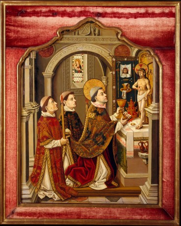
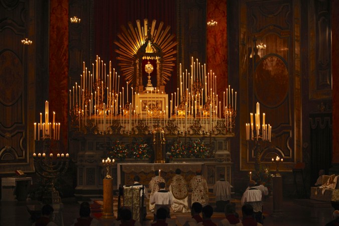
The Mass of St. Gregory. (Source).
Dreher includes unavoidably non-sacramental communities in his project in the name of ecumenism and (probably) book sales. After all, he goes so far as to state outright, “It is beyond the scope of this book to tell other Christians how they should celebrate their liturgies while still being faithful to their theological tradition,” even if that means omitting central dogmas of the Faith (112). So, what does Dreher do instead? He pivots to James K. A. Smith’s philosophy of “cultural liturgies,” an anthropologically useful concept. Dreher takes it up as his main way of selling liturgy to Evangelicals.
Unfortunately, in Dreher’s hands, the idea of “cultural liturgies” becomes a force for the very relativism he is attempting to combat (incidentally, Smith has since disavowed The Benedict Option). In Dreher’s telling, the liturgy is primarily a good thing because of what it does to us. While no serious Catholic or Orthodox theologian can deny that the liturgy is the preeminent means by which we are divinized, Dreher’s liturgical model is overly anthropocentric. It is—dare I say it?—strikingly emotivist and subjectivist. He places his emphasis on the way repetition and chanting and incense and community can orient our desires towards the life of transcendent order. Dreher instrumentalizes the Mass to an unhealthy degree. In a strikingly Maurassian note, he seems to think that “the form worship takes” matters primarily because it can “[build] a bulwark against” modernity (113). Once again, he writes that in a good liturgy, “worshipers are communing with the eternal, transcendent realm through the ritual and its elements” (108).
The reduction of the liturgy to quasi-Confucian social theurgy is a scandal. Nowhere do we read that, even if none but the priest were there, the Mass would still be the holiest and most important ceremony on earth. Nowhere do we read of Christ’s holy sacrifice made present in the Mass, nor of the way the liturgy opens up the eschaton to mere mortal worshipers. Nowhere do we even find the words “Real Presence,” itself originally a Lutheran formulation that has since gained ground among Catholics and Orthodox. There is no need to get overly academic with any of this. Much of it already fits well with the social science he is trying to use. But in failing to rise above his own anthropological method, Dreher likewise fails to do justice to his subject.
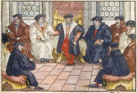
The Marburg Colloquy, where Luther and Zwingli argued about the Eucharist and failed to come up with a Protestant consensus on the sacraments. Dreher is an accidental Zwinglian. (Source).
The result? Dreher protestantizes the Mass. But not in the way that Luther or Cranmer or even Calvin might, those men who thought well and hard about God’s work in our worship. Dreher aims lower. He writes, “liturgy is primarily, though not exclusively, about what God has to say to us” (108). To be precise, no, it is not. Liturgy is primarily about what God does to us through the Eucharist. We do not go to Mass just to learn, though that is one of its most important benefits. We go to Mass to offer the sacrifice of Christ and to receive God’s supernatural life in the Blessed Sacrament. Dreher’s pedagogical model is not wrong in itself, but without a robust sacramental realism, it devolves into Zwinglianism. Liturgy is a tool for preserving “cultural memory,” not a point of real contact with the Living and Ineffable God (109). Dreher writes, “Along with helping us remember Christ, liturgy also reminds us that Christianity isn’t just a philosophy but a way of life that demands everything” (109-10). Not wrong, just banal.
Dreher follows it up with, a few pages later, “We are supposed to feel that gathering in a church as a community to offer worship to our God is something set apart from ordinary life. This is what gives rich liturgies their power” (113). Did Dom Anthony Ruff ghost-write this passage? Christ the priest and victim is what—or rather, who—gives rich liturgies their power. The actions of the congregation are entirely secondary. That’s part of the reason that there are no rubrics for those hearing the Mass.
None of these problematic statements compare to a paragraph towards the end of his section on recovering liturgy:
Now, low-church Evangelicals are absolutely right to say that liturgy won’t save you. Only conversion of heart will. Liturgy is necessary for worship to do what it must do to fulfill its potential, but liturgy alone is not sufficient, for the same reason a Bach concerto performance means nothing to a deaf man. If a believer’s body is worshiping but his mind and body are elsewhere, what good does that do? The goal is to integrate all parts of the Christian person. It takes faith and reason to form and disciple a Christian. (113).
The first two sentences are perilously close to explicit heresy (specifically, Donatism). The Tradition of the undivided Church tells us that indeed we are saved by liturgy, because we are saved by the Eucharistic Christ’s cosmic and eternal liturgy. If Dreher meant that a mortal sinner cannot receive the sacrament without committing sacrilege, then he would be correct. But he doesn’t describe sin in the rest of the paragraph. He describes ordinary distraction—venially sinful at most. Dreher seems to suggest that our own disposition is more important than the objective work of the Trinity in the Sacrament. A great deal more precision would have been tremendously helpful.
I need not appeal to Catholic dogma to hold Dreher accountable for his shoddy sacramentology. Dreher, after all, is a convert to Eastern Orthodoxy. And by the standards of his own communion, Dreher’s book is very clearly heretical. It is impossible to imagine a serious Orthodox thinker endorsing any of the incoherent liturgical propositions that Dreher puts forward. We can also see the fissure between Dreher and his own tradition when it comes to his ecumenism.

There is a 100% certainty that this guy would anathematize Rod Dreher. But also me, so go figure. (Source).
The Orthodox are far more jealous of doctrinal purity than us Catholics. They are even canonically forbidden from praying with heretics. That protective tendency is one of their more admirable traits, although it has exerted a heavy price—the nearly 1000-year schism that has separated the Christian East and West. Consider the words of Mark of Ephesus, who scuppered a scheme of reunion at the Council of Florence (AD 1438-45) by his outspoken criticism. Here are just a few of his ecumenical gems:
“The Latins are not only schismatics but heretics…we did not separate from them for any other reason other than the fact that they are heretics. This is precisely why we must not unite with them unless they dismiss the addition from the Creed filioque and confess the Creed as we do.”
“It is impossible to recall peace without dissolving the cause of the schism—the primacy of the Pope exalting himself equal to God.”
“The Symbol of the Faith must be preserved inviolate, as at its origin. Since all the holy doctors of the Church, all the Councils and all the Scriptures put us on our guard against heterodoxy, how dare I, in spite of these authorities, follow those who urge us to unity in a deceitful semblance of union—those who have corrupted the holy and divine Symbol of Faith and brought in the Son as second cause of the Holy Spirit.”
A model of Dreher-style ecumenical engagement, he is not. Consider a more recent example, such as the widely revered monks of Mount Athos. The recently canonized Elder Paisios, one of the Holy Mountain’s more famous residents of the late twentieth century, once said,
There’s no need for us to tell Christians who aren’t Orthodox that they’re going to hell or that they’re antichrists; but we also mustn’t tell them that they’ll be saved, because that’s giving them false reassurances, and we’ll be judged for it. We have to give them a good kind of uneasiness – we have to tell them that they’re in error.
And, along with most of the other monks on Mount Athos, Elder Paisios stopped remembering the Patriarch at the Divine Liturgy due to the latter’s perceived “dangerous overtures” to Rome.
That’s not to say that I agree with Mark of Ephesus, Elder Paisios, or the Athonites. I think all of them are dead wrong. My point in bringing them up is merely to note that Dreher’s approach looks mighty strange through the lens of his own tradition. Perhaps that’s why there are so few references to Eastern Orthodoxy, both in the sub-chapter on the liturgy and in the text more widely.
Eastern Christian spirituality is full of riches. My own study of authors like Metropolitan John Zizioulas, Archpriest Sergius Bulgakov, Paul Evdokimov, and Vladimir Lossky was a major turning point in my theological and spiritual journey. I date the start of my conversion to my first encounter with iconography at an Orthodox monastery deep in Transylvania. I have repeatedly found the simple wisdom of the startsy a useful corrective to my own selfishness and pride. And the Divine Liturgy of St. John Chrysostom is a truly beautiful act of the Apostolic Church at prayer.
The thing is, I suspect that Dreher would probably say much the same, too. But he doesn’t. With the exception of one reference to Father Alexander Schmemann quite late in the book, Dreher mostly brings up Eastern Orthodoxy in anecdotes describing his own faith journey. I found the absence of Eastern Orthodoxy in the book more broadly to be a particular disappointment. If there are faith communities that have dealt with cultural hostility, surely they are the Eastern churches. Observe the Greeks and Armenians under Ottoman and Turkish rule, or the Russians suffering the yoke of Communism. Why doesn’t he mention these examples? They seem directly pertinent to his project.
Dreher also explicitly references another Orthodox figure, one who proves that, at the end of the day, his ecumenical vision is just as incoherent as his historical narrative and his liturgical theology. On page 136, in chapter six, we read the following passage:
Times have changed, and so have some of the issues conservative Evangelicals and Catholics face. But the need for an ecumenism of the trenches is stronger than ever…To be sure, the different churches should not compromise their distinct doctrines, but they should nevertheless seize every opportunity to form friendships and strategic alliances in defense of the faith and the faithful. (136).
So far, so good. Here, Dreher is at his ecumenical best. He recognizes the strategic nature of ecumenism, doesn’t try to confound sacramentally distinct boundaries, and orients the reader towards positive cooperation. What a welcome volte-face from chapter five.
The problem, however, lies in that ellipsis. Because in between these two passages, Dreher inserts a toxic little sentence:
Metropolitan Hilarion Alfeyev, a senior bishop in the Russian Orthodox Church, has on several occasions appealed to traditionalists in the West to form a “common front” against atheism and secularism. (136).
The sheer audacity.
With one sentence, Dreher undermines the actual goodwill that his muddled and misbegotten ecumenical effort might have borne out among informed Catholics. Metropolitan Hilarion Alfeyev is one of the great persecutors of the Church today, a man who has repeatedly, mendaciously, and viciously attacked the Ukrainian Greek Catholic Church, even at the Vatican itself. His lies in the service of the Moscow Patriarchate’s power plays disqualify him as any kind of ecumenical model. Dreher knows this, has commented on it before, and yet still saw fit to include that sentence in the final draft of his book. I consider it the one truly unconscionable sentence in the entire text, and it makes all of his ecumenical platitudes ring hollow.

Metropolitan Hilarion Alfeyev of Volokolamsk, implacable and perennial foe of the Ukrainian Greek Catholic Church. (Source).
The Benedict Option inadvertently manages to present us with a model of ecumenism that, on the one hand, would be anathematized by the Hyperdox, and on the other, cites one of the most rhetorically violent Orthodox partisans in the official dialogue today. The result is an unsatisfactory and unsacramental chimera, a quasi-church, not the One, Holy, Catholic, and Apostolic Body of Christ.
Bad Ethos
My final criticism of Dreher is, I hope, both less pedantic and less denominational than my previous two points. I recognize that the issues I have brought up may not seem so terrible to those who a) aren’t Catholic or Orthodox, or b) don’t particularly know or care all that much about intellectual and church history. These are very specific criticisms that, I acknowledge, may run the risk of asking too much of a book written for the popular press.

The ruins of Rievaulx Abbey. (Source).
But there is a third problem, and it lies with the book’s ethos.
Every volume of cultural criticism is, by its very nature, critical. It would be unreasonable to look at a book like The Benedict Option and expect to see all kittens and rosebuds, particularly in our polemical climate. But Christians who engage in cultural criticism bear special responsibilities. Particularly if they make it their business to preach and prophesy.
First and foremost, they must speak the truth. Leaving aside the nuance issues I’ve already identified, I think Dreher is pretty good about this. He constantly slips into the confessional mode, which insures the appearance of honesty. I don’t think anyone but the most suspicious reader could walk away from the book feeling hoodwinked. The Benedict Option is, if nothing else, a compendium of Rod Dreher’s honest assessments.
A Christian cultural critic, however, must also try his damnedest to persevere in charity. He fails, and fails scandalously, if he lapses into despair.
Now, there are two relevant kinds of despair. The first is a despair of one’s own cause, a kind of bleak, Spenglerian pessimism and bellyaching. Dreher has no problems with this attitude. At his most poetic moments, he is able to see the light at the end of the tunnel. His conclusion includes a few masterfully hopeful passages.
But then there’s a far more subtle and far more tempting despair, the despair over the salvation of one’s enemies. Our culture and our political system have gone mad on this kind of despair. It polarizes and dehumanizes. Why? Because ultimately, it is a despair of God’s mercy.
Dreher is guilty of precisely this kind of despair.

“Christ’s Descent Into Hell,” Hieronymous Bosch, c. 1550. A painting that resembles Dreher’s view of the world, where a few fragile saints huddle against the overwhelming hellscape – and as in The Benedict Option, you can hardly see Christ at all. (Source).
He paints a neo-noir landscape in black and white. Unlike the world that you and I inhabit, it is merely the stage for a Manichaean spiritual and cultural drama. The villains of Dreher’s narrative are not individuals with souls in need of salvation, but dark and impersonal forces closing in on a haggard band of True Believers. The most important of these demonic forces is the LGBT movement. Dreher returns to it ad nauseum. No other threat to mankind, the West, or the Church—not war, not Jihad, not environmental collapse, not racism, not economic downturn, not secularism as such, not consumerism, not Transhumanism, not euthanasia, not even abortion—occupies such a shadowy and potent throne in Dreher’s imagination. Everywhere looms the deadly threat of the Great Gay Menace.
Rowan Williams, among others, is right to call out the book’s single-minded obsession with this issue. Over at The New Statesmen, he writes,
Yet there are aspects of his rhetoric that leave a deep unease. “The LGBT agenda” is a phrase that appears on the third page of the first chapter, and the prominence given to same-sex relations reinforces the common perception that the only ethical issues that interest traditional Christians are those involving sexual matters. In recent interviews, Dreher has been rather less vocally negative about same-sex relations in general than he seems to be in this book, but the phraseology (as in the derogatory use of “transgenderism”), here and elsewhere, sounds a note of angry anxiety and contempt typical of some voices prominent in conservative American religious circles, and somehow jarring with the commendation of Benedictine hospitality and equanimity.
Indeed, some of Dreher’s liberal interlocutors have written potent criticisms on just this point. Alan Levinovitz calls The Benedict Option, as well as Anthony Esolen’s Out of the Ashes, “spiritual pornography,” which he defines as literature that is
…designed to arouse climactic cries of Yes! Yes! in its readers, pleasing the soul’s darker parts by swapping a hollow fantasy of physical union for an equally hollow fantasy of moral warfare…a virtuous few battling mightily against everyone else…Calling spiritual pornography a fantasy helps to evoke its psychological appeal, but the world it conjures up is closer to that of the fairy tale. Both genres are built on two foundational features: dramatic arcs that proceed from Order to Disorder to Order, and clearly defined roles and rules that map neatly onto good and evil. It’s a world that trades humans for archetypes, nuance for simplicity, and the tangled skein of history for the orderly vectors of myth — but if you’re on the side of the angels, living in it feels really, really good.
I won’t go so far as Levinovitz, whose own polemical rhetoric has bordered on the illiberal in the past. What Levinovitz does capture, however, is Dreher’s sometimes hysterical distress over LGBT activism and liberal modernity generally. Levinovitz argues that “the soul of these books is not love of God; it is bitter loathing of those who do not share it.” He isn’t far off the mark.
But liberals who write off Dreher as nothing more than a cantankerous homophobe are doing him and the text a great injustice. To understand Dreher’s approach, we also need to look at one of his better moments. Late in the book, Dreher includes a profile of Spiritual Friendship, and specifically Ron Belgau. Some of what he writes about the experience of gay and lesbian Christians attempting to live a life of chastity is genuinely empathetic. Dreher wouldn’t have bothered to include their inspiring ascetic example if he had some lurking bigotry. Dreher isn’t a homophobe. By all accounts, he never advocates for any hatred or fear of individual LGBT people.
What he does fear—or, more precisely, what the book fears—is all LGBT people and all liberals in the abstract. This fear entails a convenient rhetorical move. It lets Dreher confound and occlude the individual personhood of his ideological opponents in such a way that it is easier to consign them to the outer darkness en masse. For if they are not out there, then it will be us, the few, the faithful. Here we can see the ripple of dread that runs through the text.
For instance, Dreher writes that “we in the modern West are living under barbarism, though we do not recognize it” (17). At one point in the book, Dreher calls the LGBT movement “the tip of the spear at our throats in the culture war” (alas, I could not find the page, so I offer you the quote via David Brooks’s review in the New York Times). Dreher suggests that
In the wake of Obergefell, Christian beliefs about the sexual complementarity of marriage are considered to be an abominable prejudice—and in a growing number of cases, punishable. The public square has been lost. (9).
He also writes,
…the day is coming when the kind of thing that happened to Christian bakers, florists, and wedding photographers will be much more widespread. And many of us are not prepared to suffer deprivation for our faith. (63).
Or this passage in his chapter on Christian labor:
We may not (yet) be at the point where Christians are forbidden to buy and sell in general without state approval [!!!], but we are on the brink of entire areas of commercial and professional life being off-limits to believers whose consciences will not allow them to burn incense to the gods of our age. (179).
Followed up shortly by the statement that “the only thing standing between an employer or employee and a court action is the imagination of LGBT plaintiffs and their lawyers”(181).
The reader can make his or her own judgment about these words. For my own part, I consider Dreher’s contempt a profound, if understandable, failure of Christian charity. At Easter, his own Church sings, “Let us call brothers even those who hate us and forgive all by the Resurrection.” That spirit never enters into The Benedict Option in any sustained way. Others have discerned in it a lack of Benedictine hospitality. Levinovitz finds in it a certain resemblance to Jack Chick’s tracts. That’s probably unfair. Dreher’s contempt isn’t sectarian or vicious enough.
The book shares far more important affinities with Atlas Shrugged.
In both, we read of a few stalwarts fending off the gathering darkness of cartoonish, straw-man villains. In both, we encounter a worldview that is increasingly binary, predicated not on the messiness of actual reality but on the black and white imperatives of abstraction. In both, the heroes must enter some kind of retreat (is there any literary analogy to your unfriendly local “Benedict Option community” so apropos as Galt’s Gulch?). In both, we get the sense that the author is entirely self-assured of their own rectitude. And in both, we find the same attitude of contempt for the world, an attitude that is, to borrow the words of Nostra aetate, “foreign to the mind of Christ.”
When Whittaker Chambers famously reviewed Atlas Shrugged for National Review, he wrote that,
Dissent from revelation so final (because, the author would say, so reasonable) can only be willfully wicked. There are ways of dealing with such wickedness, and, in fact, right reason itself enjoins them. From almost any page of Atlas Shrugged, a voice can be heard, from painful necessity, commanding: “To a gas chamber–go!”
He wasn’t wrong. John Galt declares,
All the men who have vanished, the men you hated, yet dreaded to lose, it is I who have taken them away from you. Do not attempt to find us. We do not choose to be found. Do not cry that it is our duty to serve you. We do not recognize such duty. Do not cry that you need us. We do not consider need a claim. Do not cry that you own us. You don’t. Do not beg us to return. We are on strike, we, the men of the mind. (For the New Intellectual 131).
At its worst, this is what the Benedict Option becomes. If there are communities that seek to build on Dreher’s more positive and productive suggestions, I wish them well. But I also pray that they leave aside his own venom. It is the final, toxic fruit of forgetting the Eucharistic love of Christ.

With The Benedict Option, Rod Dreher confirms his place as the Ayn Rand of conservative Christianity. (Source).
Conclusion
I hope to explore my own propositions in my next post. The Church does furnish an excellent example of a saint who dealt with cultural conditions much like our own. I, too, have an “option” I’d like to offer for your consideration, one which is congruent with some parts of Dreher’s book. I’d also like to correct what I see as some of the problems of The Benedict Option.
But not without an important acknowledgement first.
In her review of The Benedict Option, Elizabeth Stoker Bruenig points out the fundamental cultural flaw in Dreher’s project; we have been irrevocably formed by modernity. She observes,
There never will be another Medieval subject. All of us in the Anglophone world see with liberal eyes and hear with liberal ears, and to some degree think with liberal minds: Indeed, the lament that we’re no longer Medieval is a comically typical liberal refrain (think of the Romantics, with their Gothic revivalism, or the pre-Raphaelites, with their knights in shining armor). The will to be Medieval subjects again is the desire to return to an age of faith, but this is not an option.
I think it is perhaps this quality that, to paraphrase the remark of a friend, makes The Benedict Option such a great call to conversation and such a poor call to conversion. But it was also, for me, a serious cause for introspection.
And I have to thank Rod Dreher for that.
Reading and reflecting on The Benedict Option made me confront several of the pretensions that I have carried around for a very long time: my ostensible anti-modernism, my belief in the fundamental importance of community, my traditionalism. It didn’t cause me to abandon them all, per se, but to see their limits, refracted and magnified through Dreher’s problematic project.
The Benedict Option helped me realize that I don’t really think the world was better before modernity. Every age has been full of tyrants and heretics, massacres and miracles, heroes and hysteria. No epoch is ever really better than any of the others, for what one may lose, another may gain in some unforeseen way. Human nature remains the same. Only the Incarnation of Christ marked a real departure, an intervention that radically transfigured the course of history.
But since then, God graciously allows us to live with our own cultural era’s particular troubles for reasons that remain cloaked in mystery. Perhaps we are meant to “Redeem the time.” The secret animating principle of history is the work of the Holy Spirit in the Church. Let us trust in Providence. If we are given this moment, with all of its challenges, then let us praise God for that gift.
I am a creature of modernity. If you are reading this, so are you. That is an unavoidable fact. As T.S. Eliot writes of the Christian relationship with history,
It is not to ring the bell backward
Nor is it an incantation
To summon the spectre of a Rose.
We cannot revive old factions
We cannot restore old policies
Or follow an antique drum.
(“Little Gidding” III).
It is for these reasons that I cannot go where Dreher goes. I’ll admit, finding “The point of intersection of the timeless/With time” is always difficult. But let us never fear! “This is the day which the Lord hath made: let us be glad and rejoice therein” (Psalm 118: 24 DRA). With the Eucharist in our midst, we can and must live “for the life of the world” (John 6:52 DRA). Only by cleaving to the Eucharistic Christ can we fulfill our duty to be “the Word within/The world and for the world,” in the words of T.S. Eliot. Let us learn to love the world—tragic, sinful, broken though it may be—at the foot of the Eucharistic God. We can never love it more than He does.
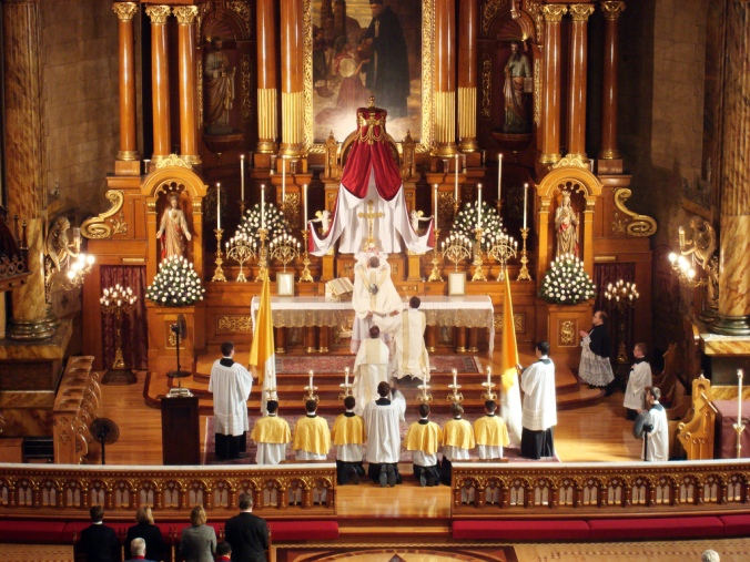
The Traditional Mass is not Medieval, but Modern. Yet that does not stop it from also being timeless. (Source).


_-_WGA01299.jpg)